Friday, April 29, 2011

Dazzling Designs | Spiraling Skyscraper Farms


The Dystopian Farm Project brings a new aspect into skyscraper farms.  If you saw my post on the Dragonfly, you could tell that this is very similar.  Ironically, it is in New York City.  (just like the Dragonfly)Also, I don't like when things are created that won't serve a purpose.  So it is always good when architecture is used to help people and make our lives easier. 

Did you know by nearly 2050, about 80 percent of the world's population will live in urban areas?  Growing things in cities with the use of skyscraper farms are an affective solution to spacial crowding, considering that there will be almost no more room to farm.  It is designed for the Hudson Yard in Manhattan.  Modelled after plant cells and ferns, the Dystopian Farm will have rooms for farming, residential areas, and markets. 


Eric Vergne, the designer, says, "Through food production and consumption, this skyscraper sets up a fluctuation of varying densities and collections of people, bringing together different social and cultural groups, creating new and unforseen urban experiences that form and dissipate within the flux of city life.”  Clean, natural, and organic food is what our growing world needs to flourish.

- Information and pictures from Inhabitat.com.

Thursday, April 28, 2011

Today's ArchiPic #44

The Torre Galatea Figueras in Spain by instantshift.

First of all, this structure is very creative, and second of all, it has eggs on the top of it!  The Torre Galatea Figueras in Spain is a very strange and innovative building.  Wow!  How diverse can it get?

Tuesday, April 26, 2011

Book Favorites #2

Welcome to the second installment in my Book Favorites series.  Here is another very interesting section of the biography I'm reading about one of the most famous architects off all time: Frank Lloyd Wright.  This next section of the book will talk about the D.D. Martin House that Wright designed.  It is a perfect example of the Prairie style.  Here is a picture of the house.


                                          "And then there were the flower pots.  Wright was
                                             obsessed with flower pots, big ones, five and six
                                           feet across, grand enough to be called "urns."  He
                                           used them to punctuate the long sills of walls and
                                              to finish majestic blocks of masonry with a flourish. 
                                               Lots of flower pots.  Some people didn't understand
                                               the need for all those pots, especially clients who
                                          hadn't requested the vast, expensive, custom-made
concrete cauldrons big enough to sleep in."

- Up Close: Frank Lloyd Wright by Jan Adkins


Today's ArchiPic #43

The pyramid in Giza, Egypt by seeker401.

I felt like I should start putting some ancient architecture on my blog because this blog is growing!  (You know, just to make it more diverse.)  Anyway, the Pyramids at Giza are amazing and mind-blowing to say the least.  And I thought Today's ArchiPic should feature one of these crazy man-made structures! 

Sunday, April 24, 2011

Church Sundays | Week 7

File:A View of Lincoln Cathedral - geograph.org.uk - 577136.jpg
File:Cathedral and Castle Square - geograph.org.uk - 134108.jpg
File:Exchequer Gate.jpg


This is a very beautiful cathedral in Lincoln, UK.  It's called the Lincoln Cathedral, and it shows the architects' creative visions.  From 1300–1549 the Lincoln Cathedral was the tallest building in the world.  It stood at 271 feet.  In the 12th century the cathedral was destroyed by an earthquake, but was rebuilt in the years to come.  The central spire collapsed in 1549, and it has never been rebuilt.  Although with it, the tower reached 525 feet at one time.  Then in 1549, the cathedral was shortened significantly because of the collapse.  The cathedral has inspired countless architects through the centuries, and it is still being admired today.

Quoted | Feelings

Why can't we have those curves and arches that express feeling in design? What is wrong with them? Why has everything got to be vertical, straight, unbending, only at right angles - and functional?
- Charles, Prince of Wales

Special Easter Architecture Pics!

Mumbai, The Cybertecture Egg

China, Shenzhen, The Tiley Opera House


London, 30 St Mary Axe Building

This structure is the world’s largest Ukrainian Easter egg.  It stands at 31.6 feet in Canada.  Wow!  Egg-shaped architecture is really crazy!  I especially like the last one because it is a mega Easter egg.

Happy Easter!

Wow, I haven't posted in awhile, but I decided I would do a lot for Easter Sunday!  I have already posted Today's ArchiPic, and there is more to come.  Including special Easter architecture pictures, Church Sundays, and a Dazzling Designs post coming later tonight.  Also look forward to the next installment of Quoted and a section of my Frank Lloyd Wright book!  This is all coming tonight on The Art of Architecture!  Be sure to stay tuned and happy Easter!

Today's ArchiPic #42


China, The Beijing Opera House
Since it was Easter, I decided I would post some special things.  For example, Today's ArchiPic features the Beijing Opera House in China!  Beautiful, isn't it?

Wednesday, April 20, 2011

Gothic Architecture

Gothic architecture was common in the late medieval period.  Their huge cathedrals and spires show the best of it.  This kind of style of architecture is one of the most beautiful in the world.  You can see it all around you in Europe.  It lasted from the 12th century to the 16th century and that is pretty long for an architectural style.  Gothic most recognized in cathedrals and churches. 


"Gothic" is NOT referring to the history of Goths, but is in turn referring to what a 19th-century correspondent in the London Journal Notes and Queries says, "There can be no doubt that the term 'Gothic' as applied to pointed styles of ecclesiastical architecture was used at first contemptuously, and in derision, by those who were ambitious to imitate and revive the Grecian orders of architecture, after the revival of classical literature. Authorities such as Christopher Wren lent their aid in deprecating the old mediæval style, which they termed Gothic, as synonymous with everything that was barbarous and rude." 


If you look at the floor plans of most Gothic cathedrals, they are shaped in a "cruciform" or cross.  Regular cathedrals are not usually shaped this way, but most cathedrals are of Gothic architecture.  The average height of the Gothic cathedrals range around from 100 to 150 feet.  Also, the cathedrals do not always go up in a spire form.  Sometimes, the cathedrals are squared off.  It is amazing how many kinds of arches there are in these cathedrals, and Gothic architecture is one of a kind.  These ancient structures are spread throughout the whole continent of Europe, and they are always different from one another in at least one way.  I think it's safe to say that I love Gothic architecture!  I will be doing more of these "types of architecture" posts in the next few days!  Enjoy the ARCHITECTURE!

Monday, April 18, 2011

Book Favorites #1

Welcome to my new series on architecture books.  I'm not sure how long this series will last because I'm only planning on reading my biography book called Up Close: Frank Lloyd Wright by Jan AdkinsThe series will consist of my favorite sections of the book.  By me doing this it will also show you more about Frank Lloyd Wright and his amazing work!   I might start reading more in the future when I get more into architecture books, but right now I'm not that interested.  Enjoy.

"He cared about only one thing: architecture.  Clients
and laws and money weren't important.  The work was
everthing.  He used clients and their money to create his
architecture, whether they liked it or not.  Somehow he
swept his clients up into a kind of enchantment.  They
became hypnotized by his magical talk and fanciful
promises.  Under his spell, they wrote more
checks and put up with his insults and eccentricities." 

- Up Close: Frank Lloyd Wright by Jan Adkins

I never would have thought that Wright would be like that, but it is true.  I think it is because his early life was a constant roller coaster.  He was beaten by his mother, his dad left the house when he was a teenager, and worked on the farm constantly in the summer.  Wright's life was hard, and that is why I think that his personality was like this.  I will be showing more on Wright's childhood in another post.


Saturday, April 16, 2011

How Did I Get into Architecture?

Since my blog is getting more popular, and it has a lot more page views then it did a month ago, I am going to do a detailed post on how I got into architecture.  You won't believe how every little event led up to this day.  Welcome to a special edition of my blog called, "How Did I Get into Architecture?"

    I always had a thing for creativity.  I felt like it was an important part in my life, and I loved to build from a very young age.  I started off constructing with these little wooden blocks that were different shapes, sizes, and colors.  The little structures I created were almost as tall as me sometimes.  Lincoln Logs were also very fun for me to play with.  Since I went to Colorado Springs almost every year, I loved building the little log cabins. 

   Then I discovered Thrillville.  This was a theme park game designed by Lucas Arts.  You had the ability to design theme parks and walk around in them.  You also could create the roller coasters in your park which you could ride.  I felt great about the game, and because of it I wanted to be a roller coaster designer.  After Thrillville, I bought Thrillville Off the Rails on the PSP.  Off the Rails brought a new aspect to the roller coasters in Thrillville, allowing you to now make the roller coasters jump from one track to another.  Thrillville eventually became dull, and I was searching for a new game.  Then I heard of the game that would change my life forever, Roller Coaster Tycoon 3! (RCT3) 

   RCT3 brought a whole new experience to the engineering and designing aspect.  The game looked better and had a better feel.  It was also way more customizable.  You even could see your parks from any angle!  I got the game...I think...around Christmas 2007.  At first I had trouble playing it, and I remember just giving up.  About a month later I tried the game again, and this time it worked out.  I could play it! 

    My first park was ironically named "Frontier City."  It is ironic because Oklahoma City has that exact theme park.  (I've been to Frontier City so much I can't even count!)  Anyway, the park looked horrible, but being a 10-year-old I didn't care.  It looked kind of bad because it didn't have any trees!  But I wasn't that familiar with the game anyway.  I would show you guys some pictures, but the park was accidentally overwrited because I "wasn't that familiar with the game!"  The park did reach almost 3,000 guests!  (which is a lot for the game's standards)  An even bigger park that I created was called Sand Stone.  It had more than 4,000 guests.  It is so big that the frame rate drops tremendously when you come into it! 

   I played the game like that for years until I saw Steven's RCT3 Videos.  Also called Alloria, he is a guy in the UK that creates amazing RCT3 structures.  (I've posted his videos on my blog before.)  What really inspired me to start building cities in a theme park game was Alloria's city backdrops that he used for an intro to his parks.  They are amazing!  As you have seen from my blog, I've posted pictures of my cities that I have created throughout the years. 

  Where does my blog come into this?  Well, RCT3 pretty much won me over to be an architect, but that is not what made me create my blog in the first place.  This is where things led up to when I created my blog.  First, when I came into 7th grade, I had 7th hour classes that I could choose for the three tri-mesters.  (sports, media, spanish, etc.)  I chose media for my first tri-mester.  In this class we were assigned a blog with a topic, and we had certain requirements that we had to meet.  It seems pretty strict, and it was, but it made me better at writing. 

   One of the requirements was that you couldn't use the same word in a paragraph.  This is kind of hard to explain so let me show you.  For example, if I wrote, "I like architecture.  I also like roller coasters."  I wouldn't be able to use the letter "I" then "also like roller coasters." because "I" had already been used in the previous sentence as the first letter.  But as I said these requirements taught me how to be a better writer. 

   I also chose media as my third tri-mester, which is now.  This time I had a choice between two classes: The previous class with requirements, or my science teacher's class called Advanced Media.  Here we learned HTML and Javascript, which are computer code languages.  Then we got to create a blog about any topic that we wanted.  I thought about it at first and then chose architecture!  I started this blog in mid-January of 2011, and it is now mid-April and has over 1,000 page views!  This blog has grown so much, and I want to thank all those architecture blogs out there that have given me inspiration for new ideas.  I am very excited about what my blog will be like in the future.  And by the way, I see a very bright future ahead.  Anyway thanks for reading and enjoy that ARCHITECTURE! 

                                                                                                                    - Zach

P.S.  Wow!  That took a long time!  I'm about to break a sweat! ; ) 

Frank Lloyd Wright...Wow!

I bet a lot of you have seen my Quoted series, and if you looked closely you could tell that more than half of the quotes were by Frank Lloyd Wright.  Well, it just so happens that my English teacher assigned us a biography book report.  When I went into Best of Books (it's a bookstore) and went to the biography section, right in front of me was a book called, "Up Close: Frank Lloyd Wright."  It is like it was meant for me! :)  So it turns out that it will be my book for my book report coming up next month, and I'm very excited to start reading!  I will be posting my favorite sections of the book on my blog as soon as I start reading!  Enjoy the ARCHITECTURE!

Friday, April 15, 2011

Today's ArchiPic #41

[image source]

I can't believe there is a piece of architecture shaped as a washing machine!  Well, this one is exactly that in Mexico City, Mexico.  The huge mirror represents the window in a washing machine, and it looks pretty cool.  Architecture is very diverse!

Thursday, April 14, 2011

Archilego | The White House

I haven't ever thought about a lego White House, but sure enough there is one out there.  And I think this one looks awesome!

[image source]

This is really cool.  I never thought I would be interested in lego architecture, but seeing something like legos being put together to make an architectural marvel is amazing.  I will be posting a lot more of these to show how great legos are and how legos can be used to make great pieces of architecture!  For more pictures and information on lego architecture, click here.

Quoted | Shelters and Projects

"All architecture is shelter, all great architecture is the design of space that contains, cuddles, exalts, or stimulates the persons in that space."
- Philip Johnson

"Any architectural project we do takes at least four or five years, so increasingly there is a discrepancy between the acceleration of culture and the continuing slowness of architecture."
- Rem Koolhaas

Today's ArchiPic #40

[image source]

Today's ArchiPic features the Puzzling World at Lake Wanaka in Otago, New Zealand.  This is a very puzzling world!  It started out as a little maze way back in 1973, and it now consists of a puzzle cafe and optical illusions.  The puzzle cafe is where guests try to put together puzzles and figure out optical illusions.  Architect Stuart Landsborough designed the Puzzling World, and it serves as an important part of entertainment to the people of Otago. 

Wednesday, April 13, 2011

Dazzling Designs | Christ the Light

The Cathedral of Christ the Light is a beautiful and modern cathedral in Oakland, California.  It replaced the old cathedral that was damaged by the 1989 Loma Prieta earthquake.  Not only does it serve as a church, but it also is made up of a health services center, conference center, and a mausoleum.


Santiago Calatrava, of Valencia, Spain, designed the cathedral, and its design won the hearts of the judges at the Catholic Cathedral Corporation of the East Bay.  It costed 172 million dollars to complete. 


The whole cathedral also surprisingly houses a cafe, bookstore, public plaza, and a garden.  I would love to go to this beautiful cathedral someday.  Its architecture and prime superiority makes it an amazing church in my eyes and the most modern church I have seen!


Tuesday, April 12, 2011

Today's ArchiPic #39


Today's ArchiPic features the Chapel on the Rock in Arizona, United States.  I always love it when architects put their designs in landscapes.  It makes the structure even more unique, and it makes its shape more interesting to see.

Monday, April 11, 2011

Quoted | A Continuing Dialogue

Welcome to another great quote from famous architects.  I will start doing at least two quotes each post.  Enjoy this installment of Quoted. 

"Architecture is a continuing dialogue between generations which creates an environment across time."
- Vincent Scully

"Life is rich, always changing, always challenging, and we architects have the task of transmitting into wood, concrete, glass and steel, of transforming human aspirations into habitable and meaningful space."
- Arthur Erickson

I love architecture quotes.  Architects across the ages always have something interesting to say!

Saturday, April 9, 2011

The Taj Mahal | Photo Tour

As I mentioned yesterday, I was going to do a photo tour of the Taj Mahal.  Well, that is correct.  Welcome to my Taj Mahal exclusive photo tour.  Let's get started.

The Taj Mahal is one of the most recognizable buildings in the world and stands as a symbol for eternal love.  It also has a beautiful architecture that includes Persian, Islamic, and Indian styles.  It was completed in 1648 with the garden finished a couple years later.  The Taj Mahal was built as a tomb for Emperor Shah Jahan's third wife.  The emperor described the Taj in these words:

Should guilty seek asylum here,
Like one pardoned, he becomes free from sin.
Should a sinner make his way to this mansion,
All his past sins are to be washed away.
The sight of this mansion creates sorrowing sighs;
And the sun and the moon shed tears from their eyes.
In this world this edifice has been made;
To display thereby the creator's glory.


Now since you know some of the facts, let's get on with the photo tour.  I will also be adding "Did You Know?" facts.

 File:Taj Mahal reflection on Yamuna river, Agra.jpg

  • Did you know that the Taj Mahal will appear to be a different color depending on time of the day?

File:Agra, India. Monument of love and symmetry. Yada yada yada.jpg   

This is inside the Taj Mahal.  The ceiling is huge!
  • Did you know that the Taj is the most popular tourist attraction in Agra, India?

shah-jahan-and-mumtaz-mahal
image source
  • Did you know that the building took twenty-two years to complete with twenty-two thousand workers?
These are the tombs of Shah Jahan and his wife.  They are very beautiful, and the marble is extoardinary.

Waiting To Get Inside Taj Mahal
image source
  • Did you know that the Taj Mahal is listed as one of the seven wonders of the world?
File:El Taj Mahal-Agra India0015.JPG

  • Did you know that after the Taj's construction, the hands were removed from the skilled workers to ensure that no other structure could compare to the Taj Mahal?!
File:Taj Mahal reflective tiles in normal exposure.JPG

These are reflective tiles that were constructed by hand.  They are very creative!

File:El Taj Mahal-Agra India0012.JPG
File:View From Taj Mahal June 2006.JPG

This is the beautiful garden behind the Taj Mahal that leads to the mosque right ahead. 

File:TajMahalbyAmalMongia.jpg

To end, here is a beautiful picture of the Taj Mahal reflective pool.  The Taj is truly one of mankind's greatest creations, and it never ceases to amaze the tourists that visit this historical site every year!

1,000 Pageviews

It is awesome to know that people really are looking at my blog, and I'm very excited about how this blog is growing.  I can't believe I've reached 1,000 pageviews!  I've also noticed that my pageviews per day are growing.  This has been an amazing experience.

Thursday, April 7, 2011

Today's ArchiPic #38

 
[image source]

Today's ArchiPic features the beautiful Taj Mahal in India.  It is one of the seven wonders of the world and is one of the most famous buildings in ancient architecture.  The construction was completed in 1653, and it is closed on Fridays for Muslim prayer services.  This is one of my favorite ancient structures.  And by the way, I will be giving a photo tour of the Taj Mahal very soon on The Art of Architecture!  I might even do it today.

Wednesday, April 6, 2011

Dazzling Designs | Dubai Hub One

[image source]

Dubai is planning on building a central hub to provide service for the UAE.  It will specifically serve as a foyer or focal points where they will include cultural programs like art galleries, museums, and libraries.  It also might include performance stages and art auctions.  The Dubai Hub One's architecture is magnificent and extraordinary for the modern era.  Altogether, it will pretty much be a shopping center.  I heard it was designed using algorithmic waving scripts.  I also saw that the motto is, "...to convert the culture of shopping into shopping for culture."  Dubai's new central hub will serve a great importance in the city's culture and engineering.

Tuesday, April 5, 2011

Today's ArchiPic #37

File:Coit Tower at Night.JPG

Today's ArchPic features the Coit Tower in San Francisco, California.  This is a great piece of good old American architecture.  The tower is 210 feet high, and it was not designed to resemble a fire hose nozzle.  It also consists of murals from 26 different artists and numerous assistant.  By the way, this is a very beautiful picture! 

Quoted | ...a prophet...

All quotes were read by me before being put on this blog, and they will all be formally credited.  All are inspiring quotes that continue to show me what architecture is.  Welcome to Quoted. 
 

"The architect must be a prophet... a prophet in the true sense of the term... if he can't see at least ten years ahead don't call him an architect.”

Frank Lloyd Wright

Monday, April 4, 2011

Dazzling Designs | Capital Gate

My Dazzling Designs series is getting better every day.  The Capital Gate will be a mixed use skyscraper in Abu Dhabi, UAE.  The United Arab Emirates is creating some amazing pieces of architecture, and it will be 520 feet.  The Capital Gate will lean 18 degrees westward resembling the Leaning Tower of Pisa. 


To absorb this massive weight, the building has a huge exoskeleton.  The Capital Gate will hold the 5-star Hyatt Capital Gate hotel.  This is an amazing piece of extroardinary architecture!  Like I said, the UAE is creating some awesome buildings! 

Today's ArchiPic #36


[image source]

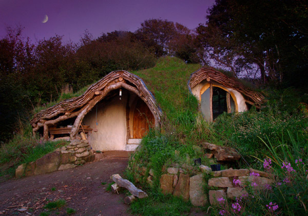
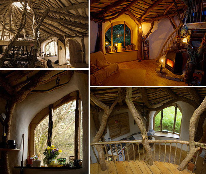
Today's ArchiPic features a low impact woodland house in Wales, UK.  It was dug into a hillside, and the excess stone and mud was used for retaining walls, foundations, and other things.  It also uses a woodburner for heat.  This house reminds me of one of those cozy cabins in the game Minecraft.

Saturday, April 2, 2011

HOUSES 101 | 3D Studio Max

3D Studio Max is a new and flexible tool for architects everywhere.  You can design models from scratch, or import models from the internet.  It is an amazing tool that can render your blueprint creations into real life structures that can be edited and shaped with very cool tools.  Here are some videos of the some 3D Studio Max creations.

[Video by darkstar.]

[Video by Roberto Deangelis.]

More information on 3D Studio Max can be found here.

WNL | Week 7

Welcome to WNL Week 7.  Today's Lights are from Minneapolis, Minnesota.

File:Skyline minneapolis night.jpg

This is a beautiful picture of the Minneapolis skyline.

File:Downtown Minneapolis at night.JPG

Here is another great downtown picture.

File:Walker Art Center-Minneapolis-night-2005.jpg

This is the Walker Art Center.  Its architecture is very modern and striking.

File:Hennepin Avenue-Minneapolis-night-2006.jpg

Downtown Minneapolis is amazing at night.  This picture was taken in 2006 looking down Hennepin Avenue.
Stay tuned for Weekend Night Lights Week 8.

Friday, April 1, 2011

Today's ArchiPic #35

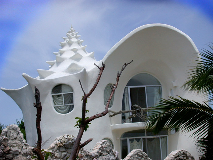
[ Conch Shell House in Isla Mujeres, Mexico by villageofjoy. ]

This conch shaped house was designed by architect Octavio Ocampo in the lovely island of Mujeres in Mexico.  The Conch Shell is one of the most outstanding and original houses on the island, and it gives you an experience of a lifetime, which is living in a sea shell!